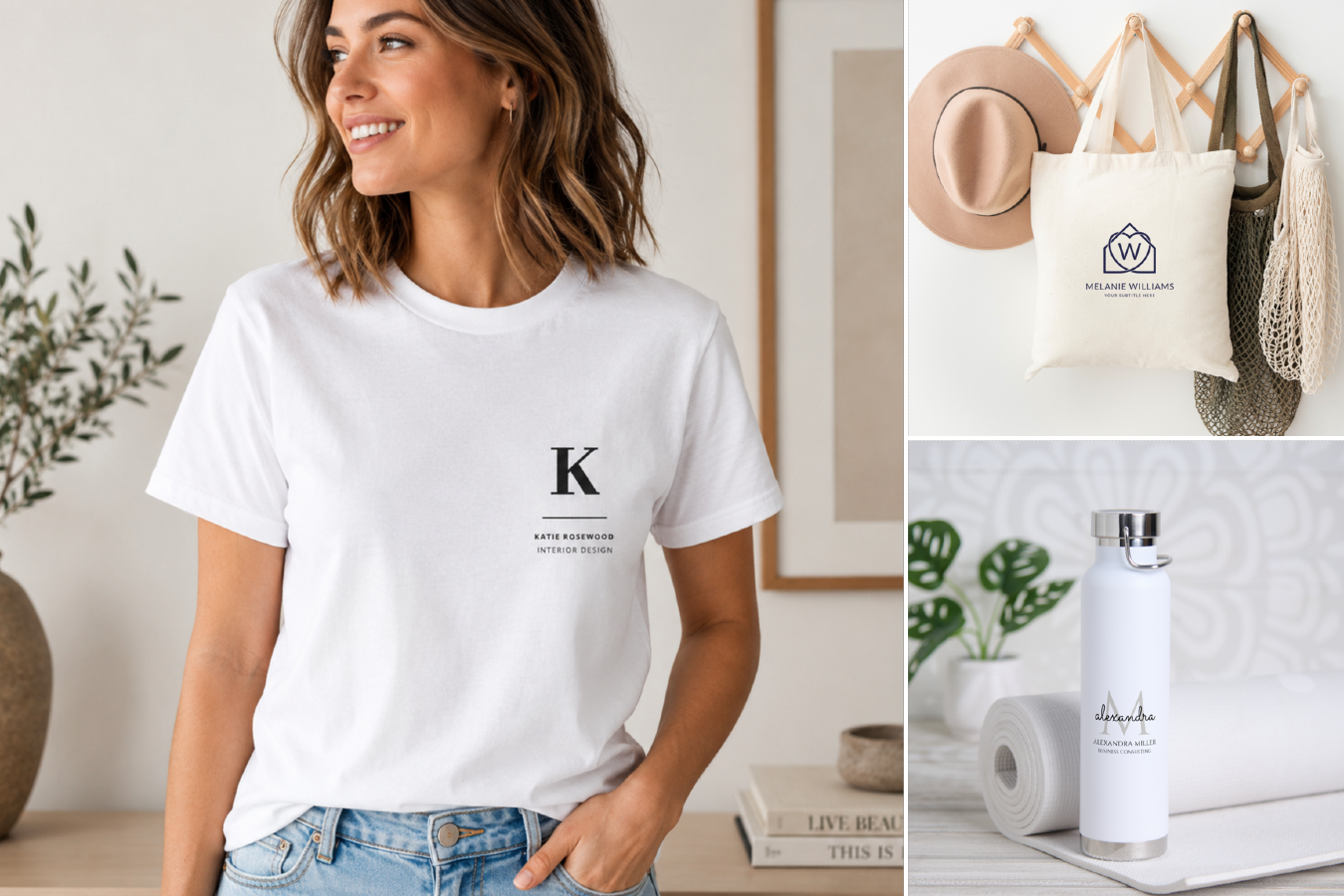
When you’re designing anything that includes text — invitations, posters, t-shirts, etc. — you’ll see pretty quickly that the font pairings you select go a long way toward establishing the overall tone, or mood, of your creation.
And as your design progresses, you might also discover the next font-and-design truth: that using just one font can make a design feel just a little … monotonous. Especially if you have a lot of text, which can make the information look overwhelming rather than inviting.
But there is a solution: Mix things up with font pairing! Font pairing is just what it sounds like. It involves combining more than one font in your design in a way that amplifies the style and impact of your text.
Of course, for non-designers, the idea of font pairing is a little intimidating. Which fonts look good together? Are there some that should never be paired? And how do you decide what text should be in each of the fonts you’ve selected?
And the truth is, with so many fonts to choose from, it’s probably going to take some trial and error to find the perfect font combinations.
But there are some general font-pairing rules that you can use to get started.
Tip 1: Choose Fonts in a Consistent Mood
Your font selections should always match the style of your design. So when you add a second font, it should reinforce the mood of the first. For instance, if you’ve started the design with an ornate, elegant font, the font you pair with it should also feel glamorous and formal. When you’re starting out with a design, it’s best to avoid mixing style opposites, like casual and formal, or childlike and sophisticated, and instead bring together fonts in complementary moods.
Tip 2: Try Fonts in the Same Family
Another good font-pairing shortcut is to choose two fonts from the same font family. For instance, you might choose a “normal” version of a font and add a “narrow,” “bold,” or “condensed” version for your subheads or other pieces of text. These fonts pairings will feel natural because they were created to be used together.
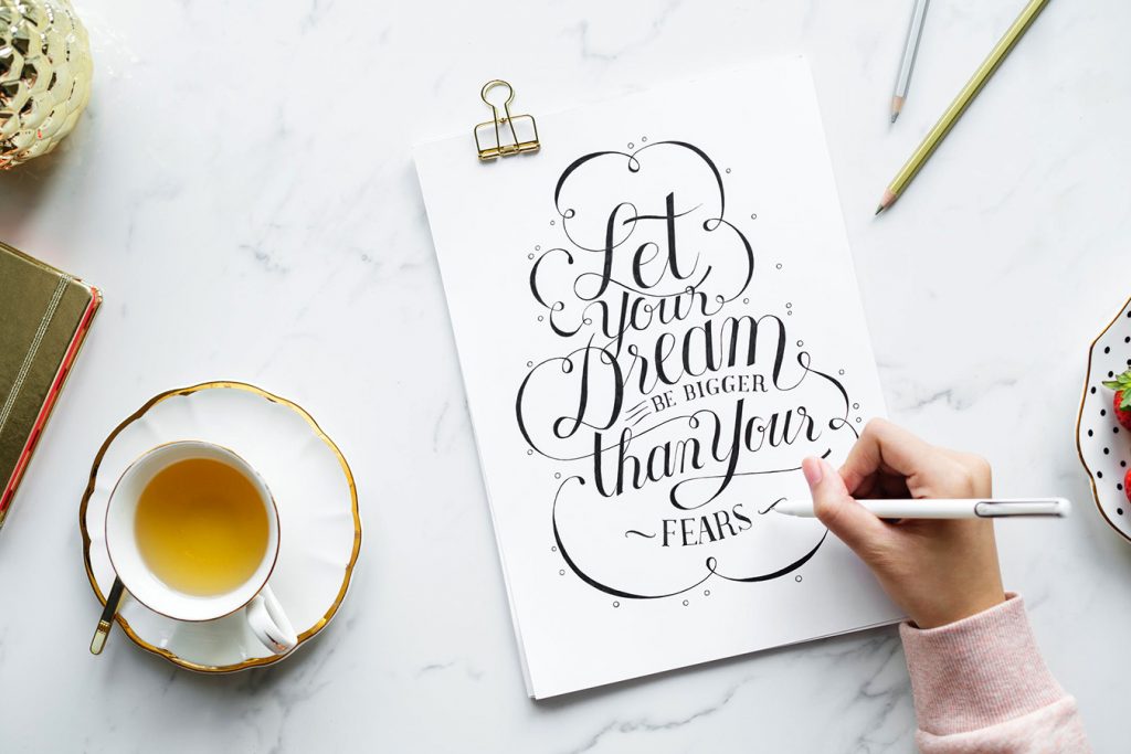
Tip 3: Consider Pairing a Serif Font With a Sans Serif Font
“What’s a serif?” you may be asking. A serif font has a little line at the end of each stroke of the letter, much like a classic typewriter font. Sans serif fonts don’t have those lines, which generally results in a cleaner and more modern look. Mixing serif fonts with sans serif fonts often creates just enough contrast to add energy without creating confusion.
Tip 4: Create Interesting Size Differences Between Your Fonts
Experts say that newbie designers are sometimes too cautious when combining fonts, and wind up pairing fonts that are too similar in size to result in an interesting-looking difference. So, experiment with your font sizes as you combine fonts. First, try a “big” and “little” combination that makes sense to you, then try a few even greater contrasts to see if they result in a more powerful impact.
Tip 5: Create Interesting Weight Differences in Your Font Pairings
In the same way you can mix fonts that are “tall” and “short,” you can also combine fonts that are wide and narrow, or thick and thin. So, to find an interesting font combination, play around with fonts of different weights to see where the most interesting contrasts are.
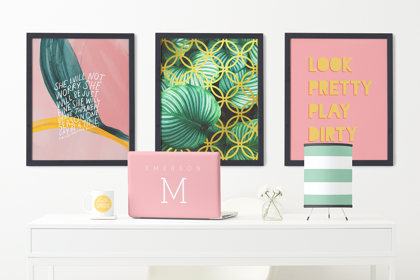
Designing font combinations that work in your design can be a fun challenge. So treat it like a video game and try different things until you discover what works best. Remember — if you don’t like what you’ve created, you can always undo your changes. For the perfect place to play around with font pairings, head over to Zazzle’s easy-to-use design tool where you can use our design tool to make Zoom backgrounds, virtual invitations and much more.

Zazzle’s Lifestyle Expert is here to help create life’s best & most important moments. Discover unique ideas and endless inspiration to create meaningful memories with family, friends and your community.