
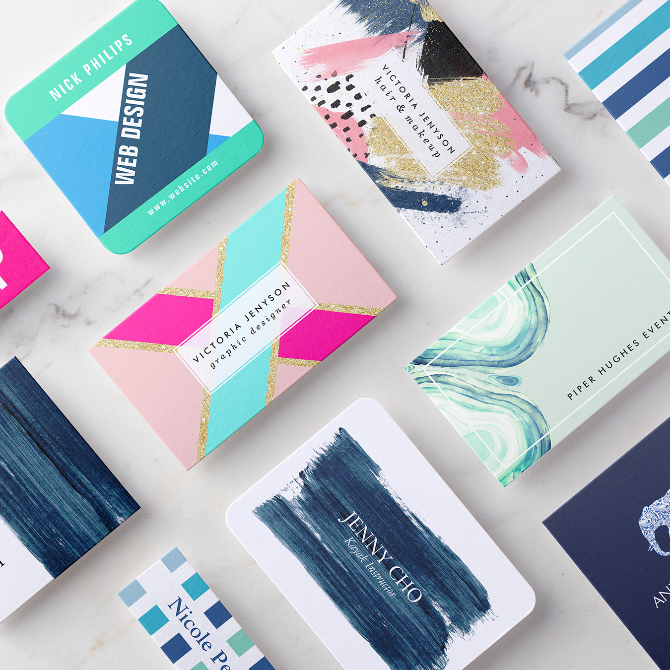
When designing your business cards, your color palette is one of the most important considerations. Along with your font and layout, your business card colors help communicate who you are and what you do. The color you choose also attracts potential customers, ultimately driving sales!
You might be tempted to pick your favorite color, the boldest and brightest hue or just plain black and white. These choices are not necessarily wrong, but you may be missing out. Different colors and their combinations can not only make your cards stand out, but also influence how people feel and react to your brand.
So from psychology to complementary color schemes, we’ll take you through the elements you need to think about when choosing your business card colors!
Color Psychology
According to psychologists, color can have an extraordinary impact on our mood – some colors are said to energize, while others make us feel calm and relaxed. Certain colors and shades also have cultural associations, from wealth to spirituality, which we may not consciously realize. Being aware of these common meanings can help you to make an informed decision for your business!
Yellow is both uplifting and intellectual and said to stimulate the brain. This could be a good choice for educators, journalists, or entertainers.
Orange is communicative, stimulating, and adventurous. So this fun and vibrant hue works for travel, community, or sports brands.
Green is associated with nature, peace, and health so is perfect for eco or wellness brands. But being the color of money, it can also suggest wealth and security.
Red is bold, action-oriented, and passionate, so it’s often seen in fast food branding. Deeper reds like maroons and burgundies can be equally dramatic, but with a more serious edge.
Blue is reliable and calming and is one of the most professional business card colors. Blue is often used by financial or legal firms who want to encourage trust.
Purple, the color of power and royalty, is seen in premium brands to exude luxury and quality. But purple is equally associated with spirituality, so is used by artists, healers, and yoga teachers.
Pink communicates care and nurturing so works for beauty brands and even charities. Pink is often seen as ‘girly’ and young but softer, dustier pinks are calming and sophisticated.
Black has many associations, from formality and mourning to power. Used with touches of white or metallics, it can be striking and stylish – think high-end fashion brands!
The Color Wheel
Once you’ve picked a dominant color for your card, you need to select other accent shades to make up your whole palette. This is where we turn to ‘the color wheel,’ which you may remember from art class!
The color wheel consists of three ‘primary colors’ (red, yellow, blue), three ‘secondary colors’ (colors created when primary colors are mixed: green, orange, purple) and six ‘tertiary colors’ (colors made from primary and secondary colors, such as blue-green or red-violet.)
The position of colors on the wheel helps us find shades that work well together and create different effects.
Complementary colors are on the opposite sides of the wheel, for example, red and green or orange and blue. The sharp contrast between these hues can really pop!
Analogous colors sit next to each other on the wheel and are often found together in nature. These combinations are pleasing to the eye, but make sure your details don’t all blend into the background.
Triadic colors are evenly spaced around the wheel and tend to create a bright and dynamic design. It’s best to balance these striking colors carefully so not to give your audience a headache!
Compound colors, also known as ‘split-complementary,’ these combinations take two adjacent colors on the wheel, and match them with a color on the opposite side of the wheel.
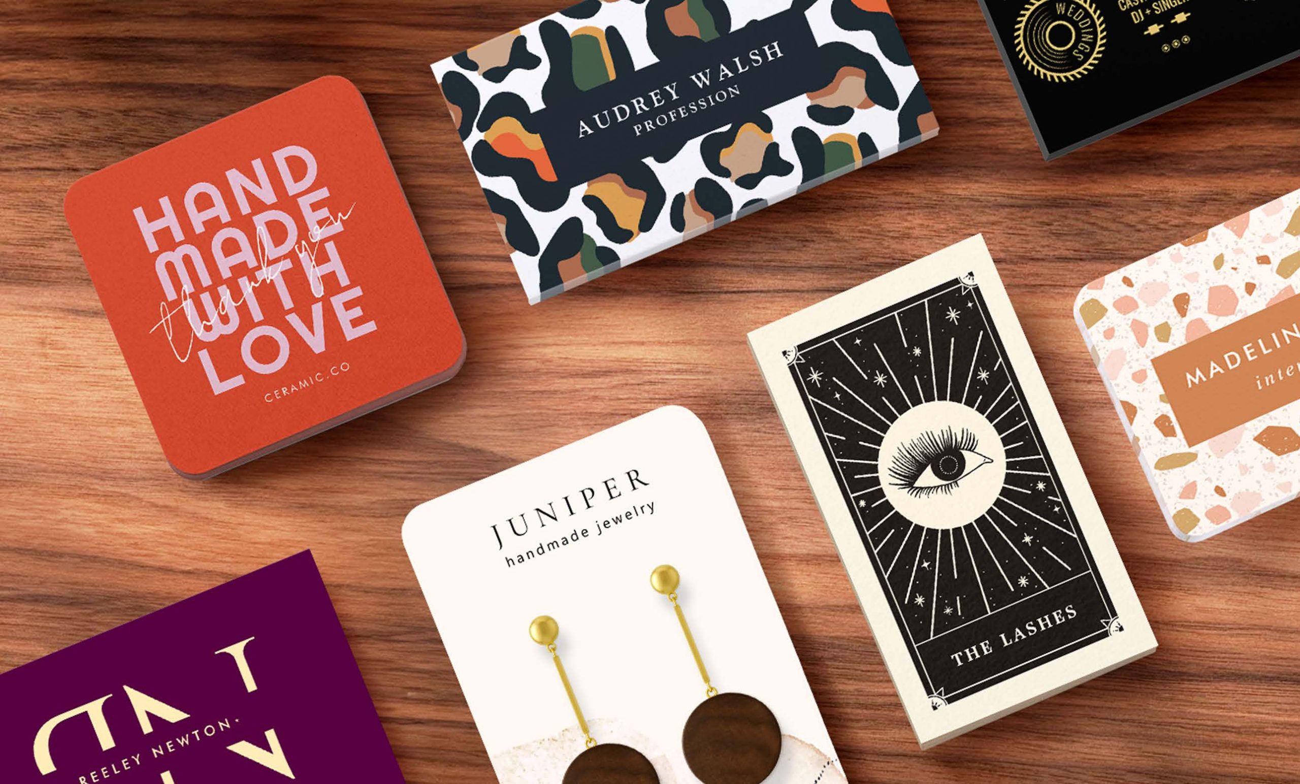
Brand First
So if you run a beauty business, do you have to pick pink cards? As interesting as color theory is, it’s not the be-all and end-all. The best color for business cards is the one that’s consistent with your current brand.
Your obvious starting point is the color of your logo, then design your business cards to match or enhance that. If in the process you change your branding, it’s important that you refresh any other marketing materials you have.
Think about your brand personality and company culture. If you’re quite a conservative business, you might go for more subdued cards. Whereas creative brands can be more playful and daring with bold color choices. It’s also worth researching how your colors compare to those of your competitors – if yours are too similar to competing brands, you risk getting lost in the crowd.
Finally, make sure the colors you choose highlight rather than hide your all-important contact details. Even the most stylish business cards are worthless if they don’t do the job!
We hope these business card color ideas give you some inspiration to make your best cards yet. Happy designing!
Matilda is Marketing Manager in the International Team, bringing Zazzle to customers everywhere from Sydney to Stockholm.
Hello I would like to make my business card what I need to do? Thank you
Hi Paulina,
You can get started on a business card design here: https://www.zazzle.com/c/business+cards
Hope that helps!