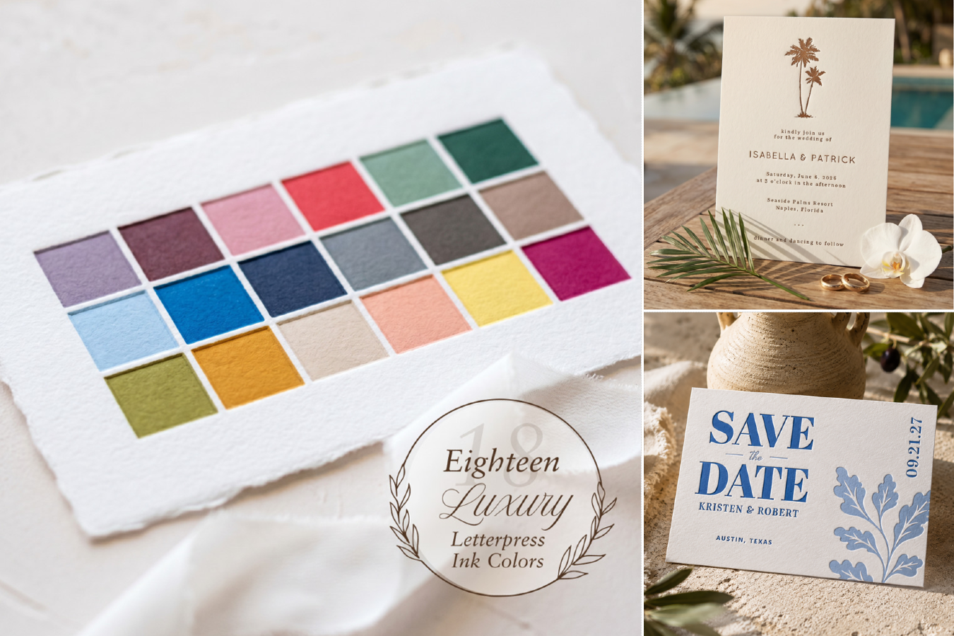
Designs: Zazzle Studios (top-right and bottom-right).
Letterpress is an art rooted in history, craftsmanship, and timeless tradition. We, here at Zazzle, are honored to introduce it to our lineup. This week, we’d like to discuss a little bit about choosing which letterpress ink color is right for you!
Your letterpress color choice influences the recipient’s first impression, dictates the readability of the text, and it’s your opportunity to define how the overall look will be perceived. It’s the defining characteristic of any card (next to, of course, the content). So join us as we discuss letterpress ink, its behavior, and some things to consider when picking (or designing) your very own card!
The Psychology of Color
Before delving into the various considerations when choosing your letterpress ink color, we feel it’s important to discuss the science behind it, and that’s where color psychology comes into play! In a nutshell, color psychology examines how different hues affect our behaviors, moods, perceptions, and emotions. Warm tones (like reds, oranges, and yellows) evoke feelings ranging from comfort to anger, whereas cool tones (like blues, greens, and purples) can conjure feelings of calmness but also sadness. It’s a relatively new area of research, and how we perceive colors is also dependent on biology, personal experience, and culture, meaning your perception of color differs from the next person!
Herein lies the importance of choosing what’s right for YOU. On whatever design you pick, play around with available color options. Ask yourself: “How does this make me feel”? Yes, the card is being sent to other people, but at the end of the day, it’s your card, so let it do the talking. In other words, just have fun!
Understanding How Letterpress Ink Behaves
Letterpress ink has some key differences from the ink used in standard CMYK printing. Comparatively, letterpress ink tends to be much thicker, pigmented, and opaque, and that’s largely down to the way it’s printed. CMYK is generally used in digital or offset printing, with the colors appearing more transparent. Letterpress, however, literally presses the letter (or design) into the chosen material, with plates covered in etched dies, and that’s what creates those elegant indentations. There may be some subtle inconsistencies of pressure and ink coverage, but that only adds to the charm! The result will always be a more natural, hand-crafted look, which contributes even more to the high-quality appeal! Be sure to check out “What is Letterpress Printing? A Complete Guide” for a more in-depth look at the letterpress printing process and its origins.
Let’s Start with Your Purpose
Zazzle currently offers 18 premium letterpress ink options, which can be seen in the table below. It’s important to note, however, that subtle color variation can occur depending on the paper type!
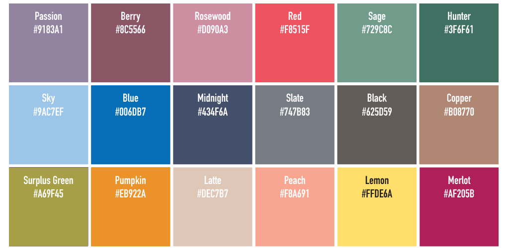
You can see that we have a wide range of colors, but not too many that it’ll make the choice overwhelming. Firstly, we need to establish what the card is for! Here are some of the options we have, but if you’re looking for something more specific, try typing in what you’re looking for followed by the word ‘letterpress’ in the search bar on our shop page: RSVP cards, thank you cards, enclosure cards, Save the Dates, wedding invitations, and Christmas cards.
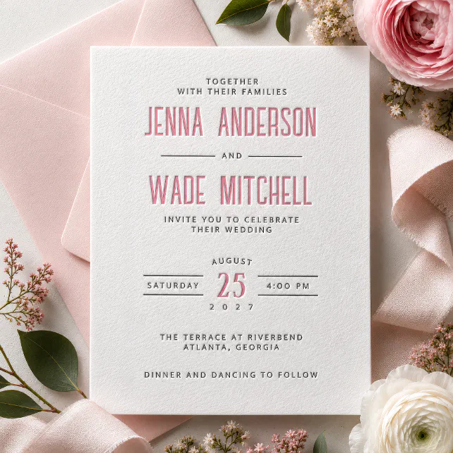
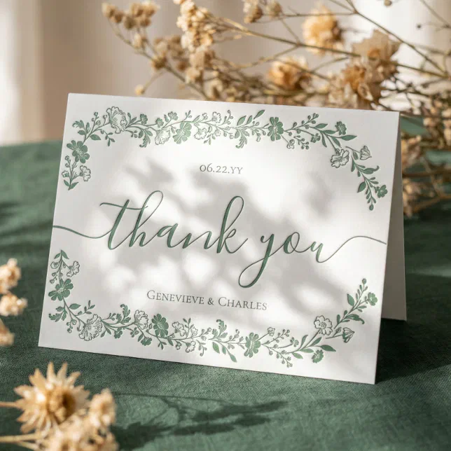
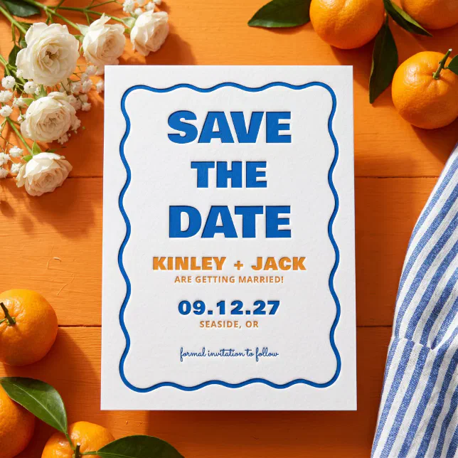
There are a few questions you can ask yourself to help choose the color: What vibe are you going for – is it nostalgic, or modern, or even rustic? Are you looking to stand out with your design, or would you rather keep it simple? Does your event or occasion have a particular theme, like a game or book-inspired wedding? Every idea has colors that naturally bring it to life! For example, ‘black’, ‘midnight’, and ‘hunter’ could suit a classic design, while ‘sky’, ‘lemon’, and ‘rosewood’ could suit a more playful design!
Which Paper Is Right for You?
Because the paper is generally thicker and made of cotton, some of the ink is absorbed, allowing the colors to have a softer, matte appearance. This combination of paper, ink, and impression allows light to scatter, which is what creates that organic look! You can also deboss the paper with no ink, meaning the recessed areas catch light and cast an ever-so-subtle shadow, adding a layer of luxury. If you’re thinking about placing an order for a large batch of cards, we’d recommend ordering just one card to start so you can get a proper feel of it and truly appreciate the final look!
At Zazzle, we offer 4 different types of paper:
- Premium Cotton – White
- Premium Cotton – Off-White
- Signature Cotton – White
- Signature Cotton – Off-White
The main difference here is the thickness – Signature Cotton offers a 20 pt thickness, whereas Premium Cotton is double that, so a 40 pt thickness. Choosing between white and off-white also affects your final result! The ink itself acts more as a tint rather than a heavy coat of paint, so the paper choice will come out with some slight variations in color. When choosing your design, click on the options in the ‘Paper Type’ section, and that’ll automatically adjust the preview so you can see how the color sits on paper! Another important thing to note is that not every product will offer premium paper – invitations, RSVP cards, Save the Dates, and enclosure cards will offer both, and thank you cards offer Signature Cotton only!
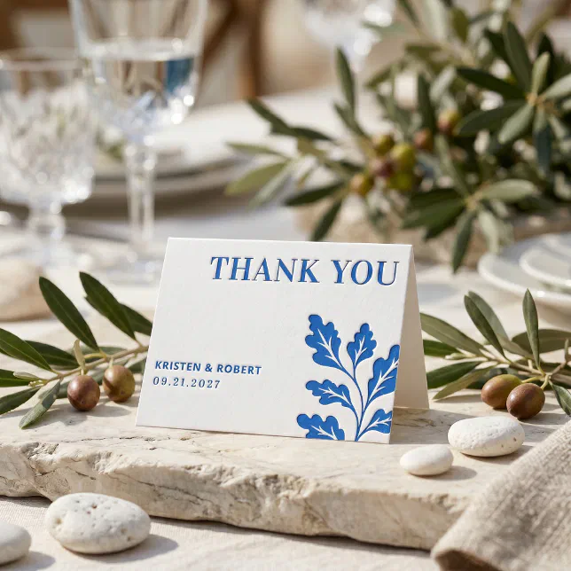
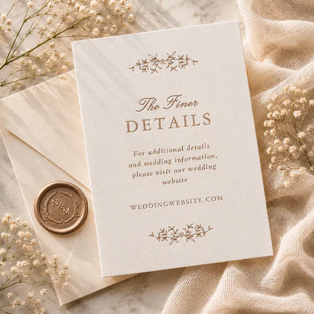
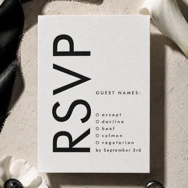
Photo & Letterpress Printing, the Best of Both Worlds
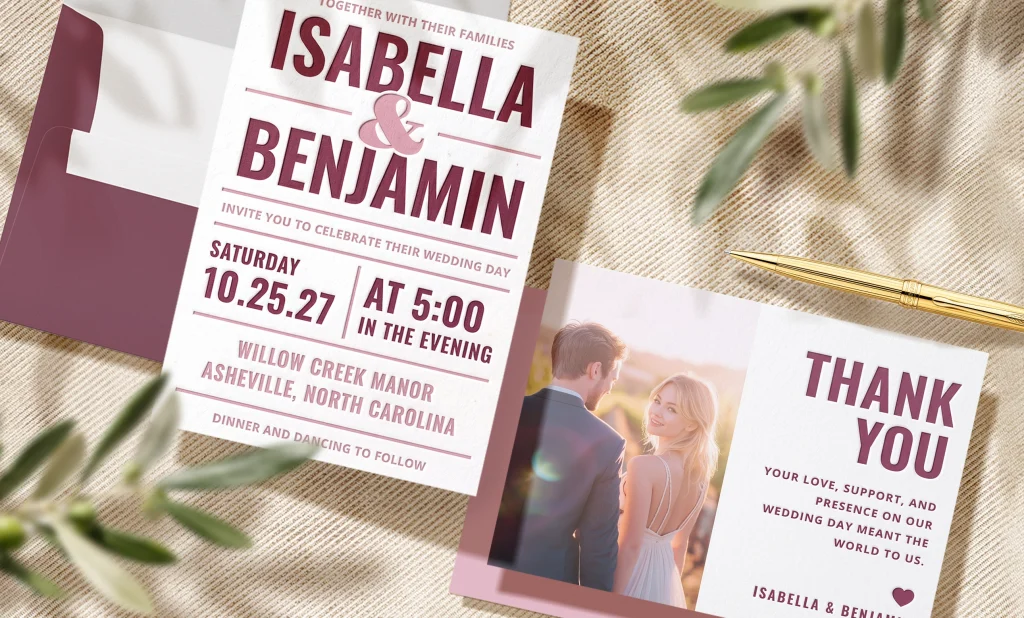
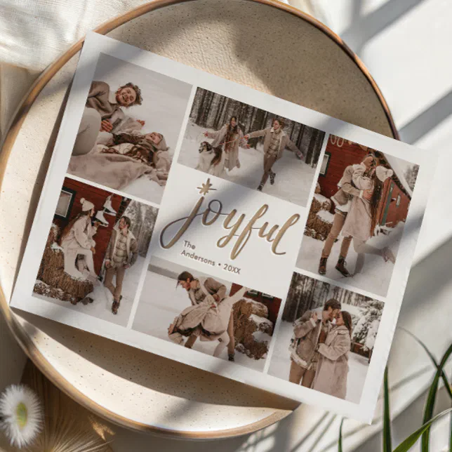
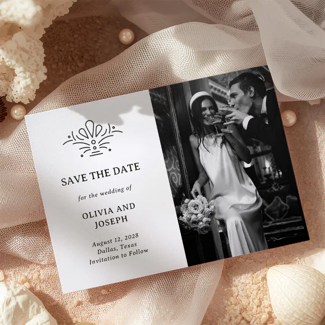
Now, for the dynamic duo – letterpress-photo cards! To achieve this, we combine our modern CMYK printing with our letterpress printing to get a very cute, very handcrafted look. For these cards, only Signature Cotton – White paper is used so that the photograph will be printed at the highest quality, while also giving the letterpress ink an opportunity to shine! These cards allow only 1 color, so once you’ve picked your favorite design, click on the options and see which one stands out the most to you. We recommend you choose your picture first, then that may influence or inspire your final ink color choice!
Final Considerations When Choosing Your Letterpress Ink Color
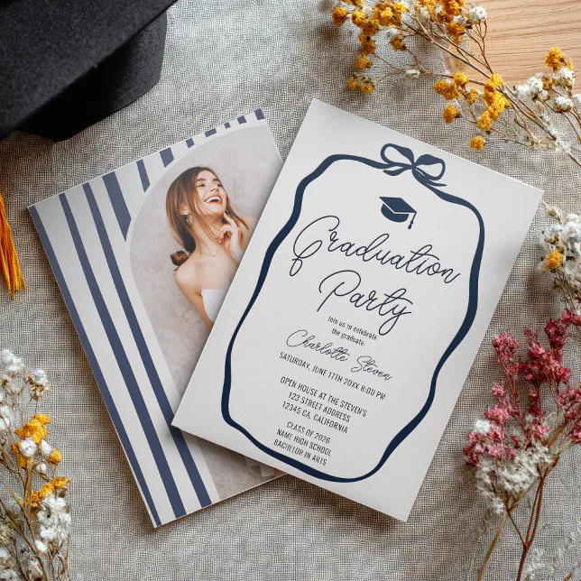
- Readability: Dark inks are better suited for text on white paper. Paler inks will still look incredible, but the legibility won’t be as clear! To be safe, we recommend darker inks for writing and lighter inks for designs.
- Combination of Colors: Consider how the colors will mix with each other. Perhaps a combo of a dark and light color, or even one color and a debossed area. Play around with the varying color combos until you’re satisfied.
- Cohesiveness: If you’re planning on ordering or designing an entire suite, then you’ll have to choose the colors carefully and with some consideration of how they will mesh together. Check out this article on “Design Your Own Wedding Stationery & DIY Wedding Invitation Ideas” for some more detailed info.
At the end of the day, the right letterpress ink color is the one that feels true to you. Long after the card ends up in a drawer, it’s those small details that’ll resonate and feel uniquely ‘you.’ If you’re feeling a bit indecisive about whether to choose letterpress or foil, another popular option, check out our article on “Letterpress vs Foil – Which Option Is Right for Your Wedding Stationery?”

Adam is a Content Specialist from Kerry, Ireland. His passions include going for long runs, video games, a love for animals, coffee, and travel!