If you’re creating your business card yourself, you may be so excited to get it printed that you’re tempted to slap the first font on your business card and call it a day. Please don’t do this!
The font you choose could be the difference between your business card going into a customer’s pocket or into a trash can. If you are not a graphic designer, this thought may have never crossed your mind.
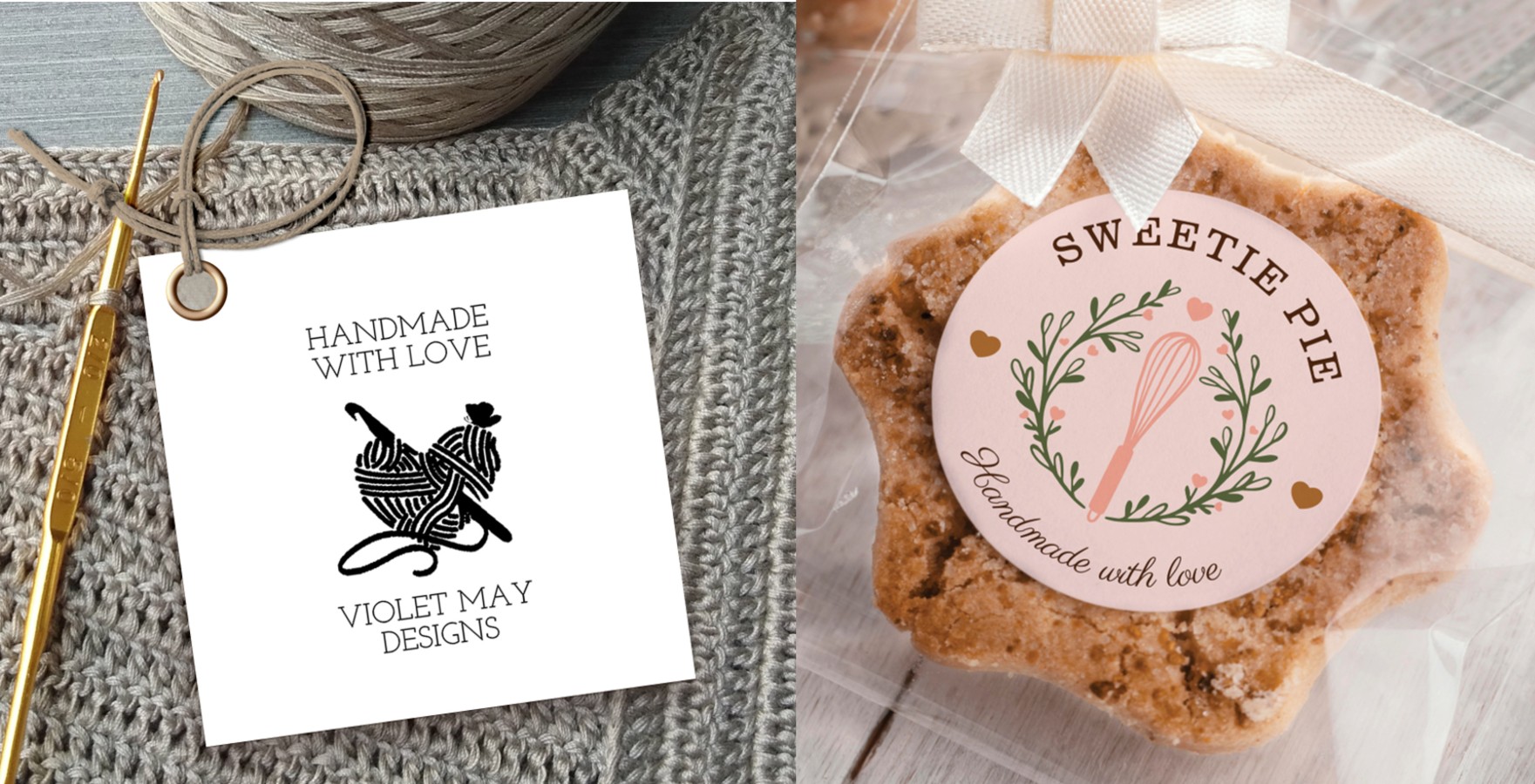
If you’re looking for a virtual business card, Zazzle’s easy-to-use design tool can help you out! Use our design tool and the strategies you learn in this article to make an amazing digital business card, and many other business marketing assets.
Why Business Card Fonts Matter
For design and aesthetics, there are plenty of reasons why business card fonts matter. But for the non-designers among us, it comes down to one main reason: the more difficult it is to read your card, the less likely customers are to keep it handy.
- Your font choice can affect the readability of your contact information, especially phone numbers.
- Lowercase, Uppercase, Bold, Italics, can clutter your business card if you are not careful.
- If your card is unreadable or too cluttered, customers are more likely to throw it away
Business Card Font Best Practices
It’s not all about typefaces when it comes to business card design. Choosing the right font is the first step, but the font size is equally important. The type size may be your customer’s first impression and, believe it or not, font size could be a make or break deal. It’s the difference between “I need a magnifying glass” and “Why is this card yelling at me?”.
A general rule is to use a font size no smaller than 10pt (but not too large) for the company name and body text. For contact information you may wish to use a font size that is smaller, just keep in mind readability. You should go no lower than 8pt, as anything less may be difficult to read.
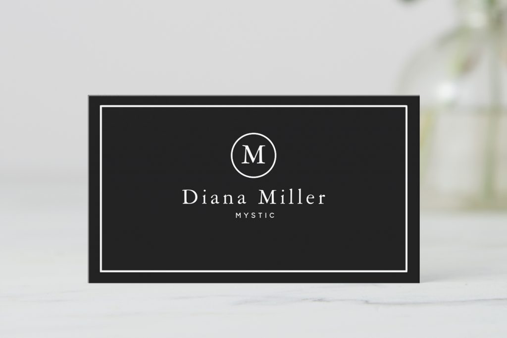
Choosing a Business Card Background Color
Once you have your font and sizing worked out, you can choose your background color. Are you going to use a white background? Maybe you want to use company colors for the background of your contact information. Colors can have different effects depending on where in the world you are. We suggest you do a little background research on what those meanings and effects might be in your culture.
Business Card Font Tips:
Here are some tips to help you choose the best font and color combinations for your business card.
- Make sure that there is a high contrast between text and background colors
- Don’t overwhelm with color – choose a few colors that work well together and stick with them throughout the other elements on the card
- Darker backgrounds typically need brighter text
- Lighter backgrounds typically need darker text
Choose a Font That’s Right for Your Business
Finally, your business card font should reflect the personality of your company. A bright pink script font, for example, would look out of place if you run a real estate company. You might get away with it if you sell baby clothes, though.
What Should You Look for in a Good Font?
You want a font that gives you a “professional business card” look. Arial, Times New Roman and Helvetica, are the most popular fonts and typefaces that businesses tend to use. The problem is, these are classic fonts that have been around for years and are not unique. What about bold and italics? Well, it all depends on the type of business. People associate bold text with power, but it can also convey an “intimidating” or “overbearing” attitude. For example, bold text might work best for a law firm rather than a flower shop.
There are more exciting fonts, of course. But some of these designs can create the wrong impression. Take Comics Sans, for example. It’s the kind of typeface you’d use when making a flyer for a children’s birthday party. Plus, people have used Comic Sans font for years. There’s nothing new about it.
If you want your brand to stand out from the crowd, you need to use a business card font that catches the attention of potential customers. Now, by no means are we saying go crazy with “wingdings” and making every word bold and italic.
Business Card Font Inspiration (4 Examples)
Now that you’ve learned some font and color best practices, you’re almost ready to design your own business card. Before getting started, there’s just one thing left to do – get inspired!
Here are some of our favorite business card fonts and why they work better than more traditional font options (like Helvetica or Times New Roman):
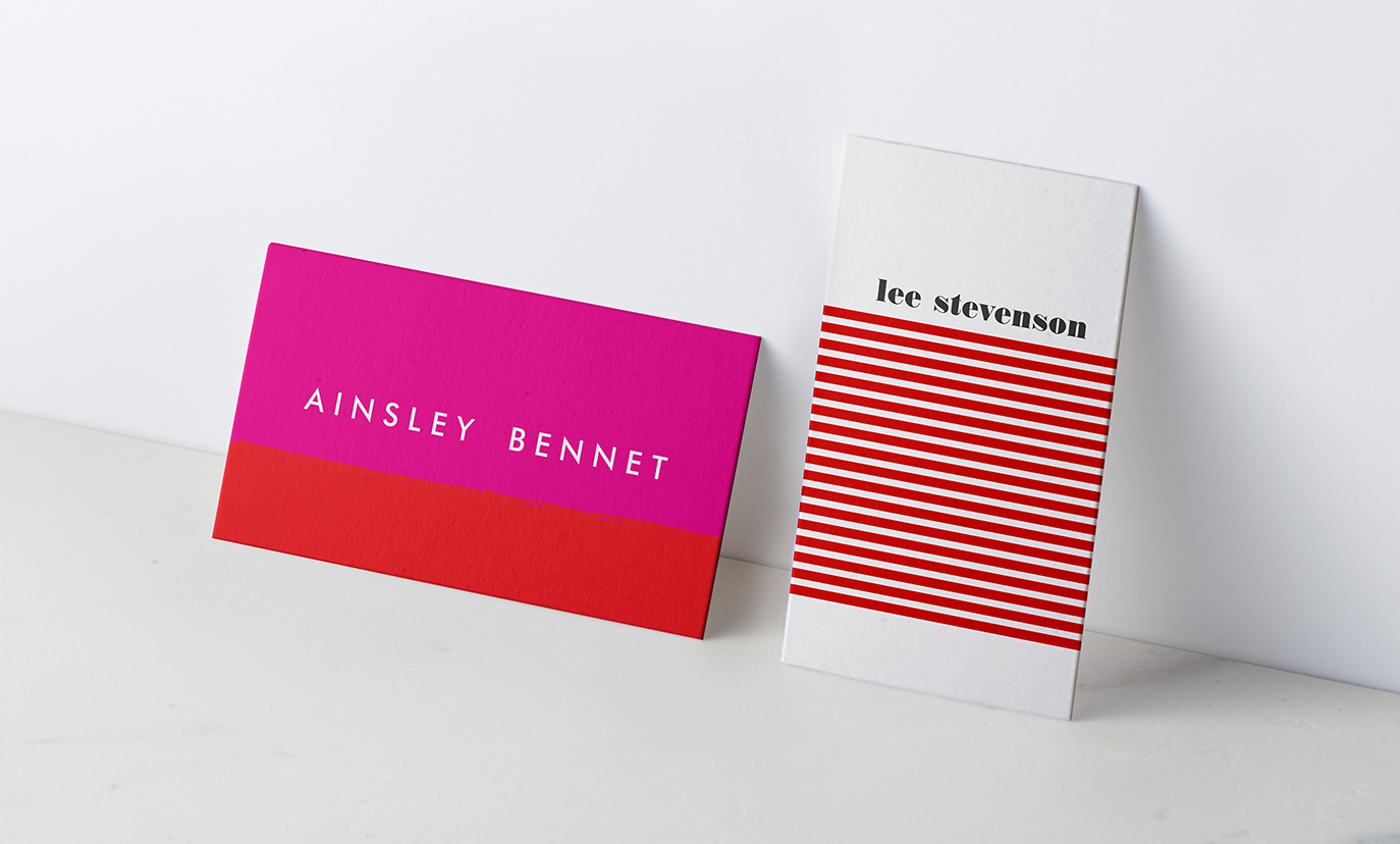
1. Cheltenham
Cheltenham is a long-established font that’s ideal for communicating your message – or even just your name! – in a clear, straightforward fashion.
2. Century Bold

People take this font seriously. It commands attention and looks like a typeface that a glossy magazine would use.
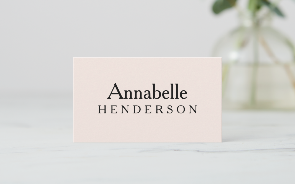
3. Baskerville
This serif typeface originates from the 1750s. Classy, easy-to-read, and eye-catching, this font would look great on a business card.
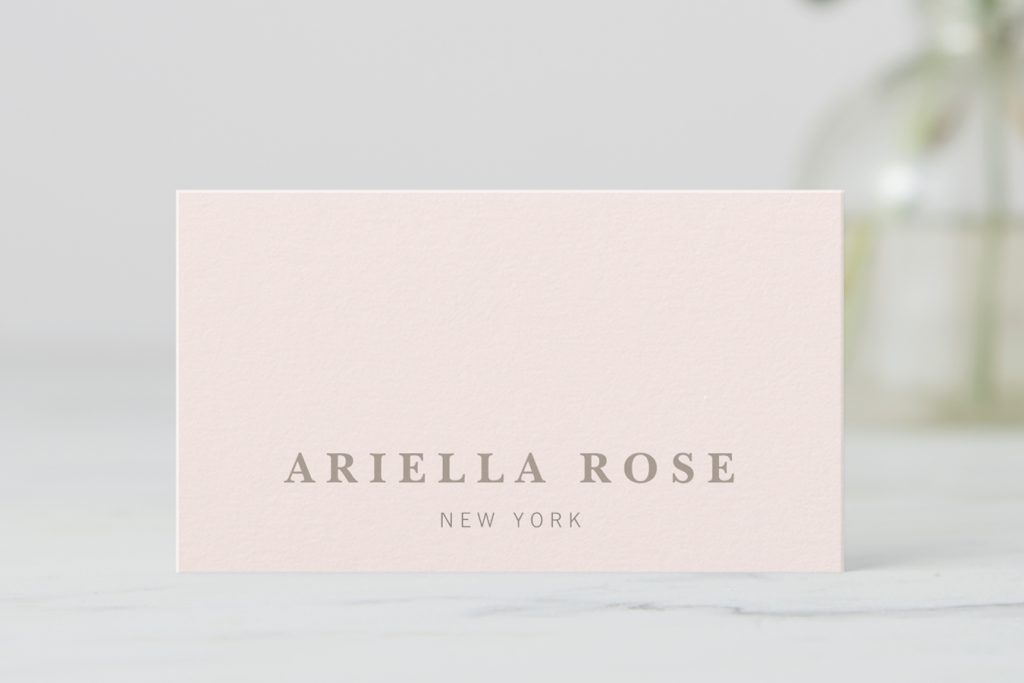
4. Garamond Roman
Garamond Roman is another serif typeface. This font looks like the writing in an old leather-bound novel. It doesn’t look fussy or boring, making it a good fit for simple business cards.
Now You’re Ready to Start Designing Your Business Card
These are just four examples of good fonts for your next business card. There are plenty of other free fonts that will help you customize your business cards so they stand out. One quick Google search will have you drowning in choices, with plenty of free font ideas that may lead to your perfect font choice.
Only 12 percent of business cards manage to resonate with potential customers and clients. What do these cards have in common? They include the right information, sell a product or service, and use a good font. Boost your chances of business card success. Follow the tips above and choose the ultimate font for your brand.

From Weddings to Tech, our Zazzle Contributors are experts on a wide variety of topics and information. We hope their advice and ideas will help you be inspired!