When you mention business cards, people do not sit up with excitement. Too often, designing them seems like another boring task. While business cards are a necessity for building and growing a business, let’s face it, they tend to blur together. You get so many that it’s difficult to keep them straight. They likely end up in a pile on your desk, never to be looked at again. Of course, that means that your business card probably meets the same fate on the desk of potential clients. The best defense against this card fatigue is to create business cards that stand out. Luckily, there are several simple ways to make your business cards more interesting and effective.
Less is More
Business cards are your way to introduce yourself and/or remind people to contact you for services. They are not a full advertisement for your business, so resist the temptation to fill them up with info. A crowded business card is hard on the eyes and will probably never be read. When designing your card, remember to leave white space to make your card design stand out, to make it easy on the eyes, and to allow the recipient to jot down notes. When people write on your card, it means they want to remember something about you and the service you provide. If they cannot make a note immediately, they are likely to forget to do it at all.
Too much information just makes your card look unattractive and, frankly, amateurish. You do need to steer recipients to your website where they can find all the additional information that they need.
Business Card Materials and Texture
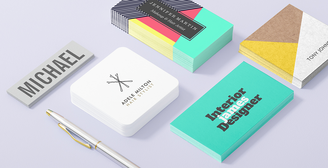
Do feel free to experiment with heavier cardstock. Thicker cards do stand out from their thinner counterparts and give the impression of luxury and success, although making them too thick means they will not fit easily into a wallet.
You can add creative interest by adding embossing or foil detail but be discerning. You want creative business cards that stand out but don’t look too ornate. Avoid the temptation to throw in the kitchen sink.
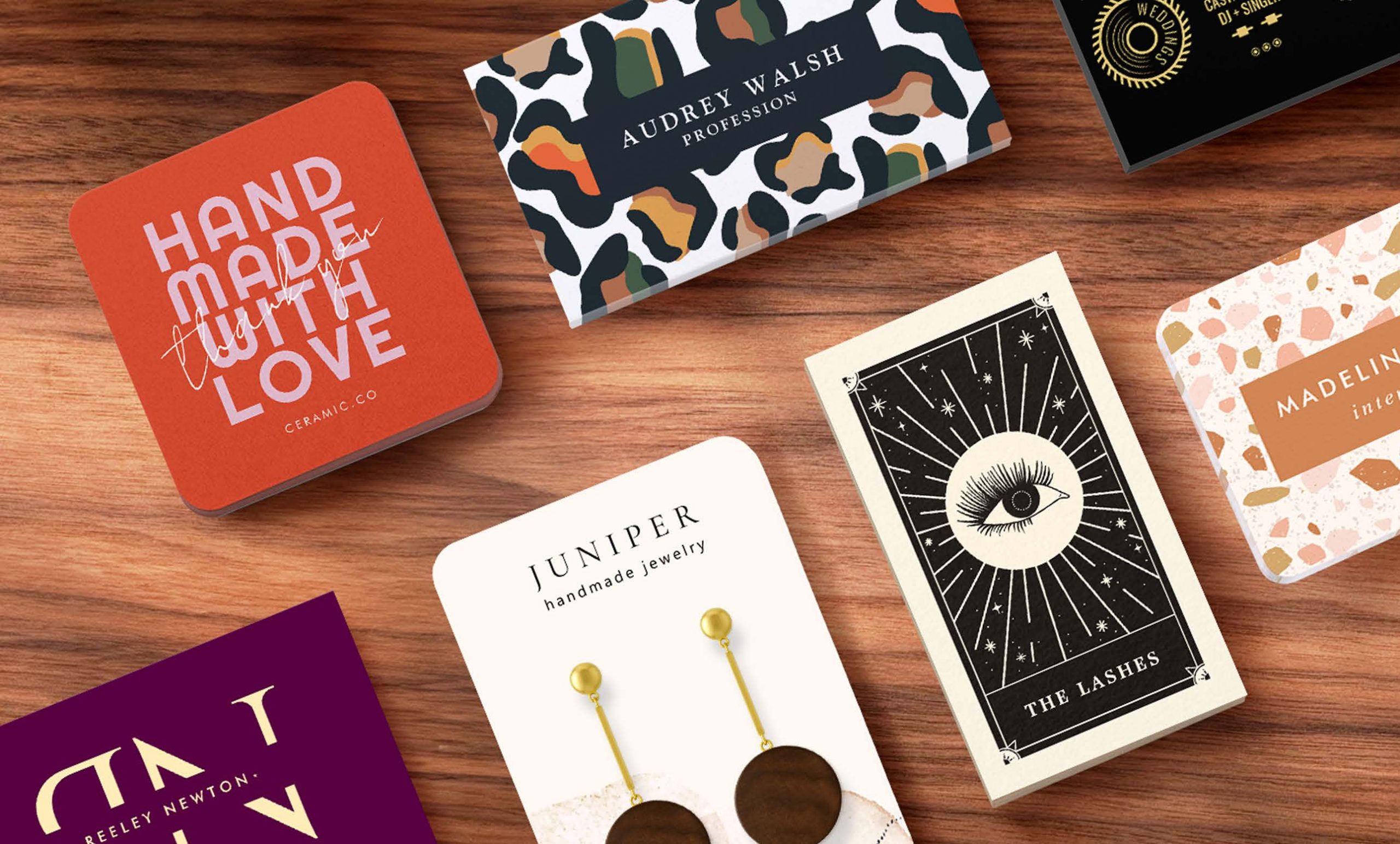
The rectangle is the go-to shape for business cards, but you don’t have to embrace it, especially if your business is a creative one. You can work with ovals, squares, cut-outs, etc., particularly if you are an ad agency, clothing designer or in some other creative business. If you are promoting your tax preparation company, you probably want to stay more conservative.
Business Card Font
You can play a bit with your choice of font. Creative business cards often stray from the overly safe Times New Roman and other go-to choices. Choose your font to reflect your business, however, and make certain that it is easy to read. You can use two fonts if you want to make a splash – one for the business name and another for the additional information. Just make certain they are complementary. More than two fonts mean your card will be confusing and visually unappealing. However, sticking with Arial is certainly not a groundbreaking move. Branch out.
Business Card Color Choices
Creative business card designs embrace the use of color. You can go with a white background, but you must use color designs, logos and/or print to free your card from the mundane. Of course, the color also needs to reflect your company’s mission. A Red color still suggests excitement with a bit of danger, while blue remains the most beloved color of both genders. Blue is also a safe color, which means it works for home security companies but not for nightclub owners. Purple is associated with sophistication, and yellow suggests a happy innocence. A kid’s clothing store may well use yellow business cards to promote their company. A financial institution will not.
Remember, an entirely black card with gold lettering still stands out and looks sophisticated, but it has been done before. Check out what your competition is doing before you make your final selection.
Business Card Size
You can experiment with the size of your card as well. While you don’t want to make it smaller than the standard 3 x 2.5, you can make it slightly larger so that it stands out from the other cards. If you make the card too big, though, it will not fit easily into a wallet, the standard card-carrying place for men and women. Your prospective client’s eyes and fingers will be more easily drawn to a non-standard-sized card. Plus, you will be more likely to win a free meal from a restaurant’s “raffle jar.”
Zazzle lets you design and order a number of creative business card designs that include exciting textures, fonts, sizes and colors. You can also find trendy business card designs and more conservative ones as well. (Remember, conservative doesn’t equal boring.) Stop modeling your business card after the ones you’ve received and design one that reflects both your business’s mission and your audience.
Your business card is often the potential client’s introduction to your company, so don’t waste the opportunity to make a positive visual statement. Design a business card that reflects your mission while displaying some personality. Boring doesn’t sell much of anything.

From Weddings to Tech, our Zazzle Contributors are experts on a wide variety of topics and information. We hope their advice and ideas will help you be inspired!
Great info! I’m interested in a card that will also double as a hang tag. The amount of products is small but on the high end price wise.
I am an administrator for Zena Alpaca, a Zazzle site and I’m VERY impressed with the products I’ve received so far.
I think Amelia is our guide and I’d like to visit with her about this.
Hi Lani!
Our customer care team can help you out with that, you can reach out to them here: https://www.zazzle.com/about/ask
Hope that helps!
This was tremendously helpful. I’m a bit dazed for having providentially stumbled upon an article so beautifully balanced. What I mean is, you constructively address the whole while carefully refusing to sacrifice any vital part. That is a rarity. Thus, your article is a gift, a genuine help. It is high-end guidance because it keeps three essential aspects of the subject ever in view (three dimensions which rarely make it to print unmashed): 1. real-world utility; 2. genuine creativity (with generous allowances for humility and sense); and 3. clear respect for abiding fundamentals (like number of fonts, white space, etc.). As a result, I have just two words to offer in response, words refreshingly different from the two that usually emerge after suffering through yet another mash-up. This time all I can say is, Thank You.