It’s difficult to understate the importance of a well-designed logo in establishing a brand identity. The best logos not only stand in for the company’s names, but they embody the spirit of the business and bring that same spirit to life in the minds of their potential customers. Above all, the best logos are instantly recognizable: although you’ll use them hundreds of times, across promotional materials, marketing campaigns, and social media channels, they should be memorable from the outset.
In the following article, we’re going to explain how you can design your own logo. You’ll join the ranks of McDonald’s, Warner Bros., and Nike in having a widely celebrated logo, and we’ll list the considerations you should take into account when conceptualizing a logo for your brand. We’ll also explain how to use Zazzle’s design tool – and, in particular, our digital designs on Zazzle Create – to bring those ideas to fruition. Let’s get started!
Making a Logo in Seven Easy Steps
Okay, so, creating a logo is – despite the title here – actually quite challenging, especially if you’re competing with time-honored, long-established brands (Coca-Cola was invented in 1886, for example, if you’re thinking of bringing your own soft drink to market). However, if we break the process down into short, simple steps, then the task becomes a lot less daunting!
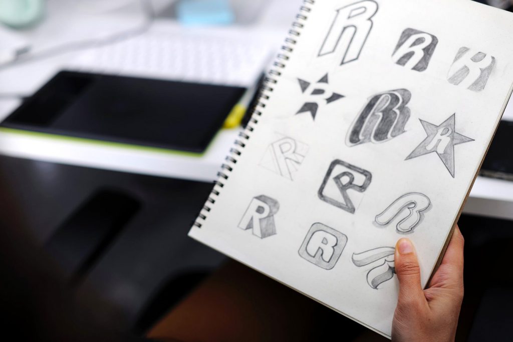
1. Get Back to Basics
Before you put pen to paper or stylus to graphics tablet, take some time to establish – or to remind yourself of – the fundamental purpose of your business. What products or services does your company provide? What sets it apart from other companies offering the same things? Who is your target audience? How would you like your brand to be perceived?
Essentially, you’re looking for what has been described by Venngage as a “brand vibe” or “brand personality.” How do you want your clients to feel when they see your logo or interact with your brand? If you’re running a security company, then you’ll want to convey professionalism and inspire confidence; if you’re setting up a creative group or artistic organization, then you’ll want a logo that’s appropriately fun and unusual.
2. Do Your Homework
No, don’t run away! Yes, we know the prospect of conducting market research and completing competitor analysis can be dull, but it’s crucial that all logos are designed in context. What kind of logos are your competitors using, in terms of colors, fonts, and shapes? Which do you think works best or worst? Have these companies had to rebrand at any point, and how did they handle it?
By and large, brands – and their associated logos – should try and differentiate themselves from what the competition is doing (particularly when it comes to companies with bad reputations). If you learn that a poorly performing brand in your sector uses a yellow, angular logo, then you’ll want to distance yourself from that as much as possible: opt for a completely different design so as to avoid being ‘contaminated’ by that yellow-angular-brand-that-nobody-likes.
3. Watch It Take Shape
At their most basic level, logos are combinations of shapes; think of Microsoft’s logo, for example, which consists of just four colored squares. By reducing a logo design to its bare geometric shapes, you’ll be able to create something that looks good even in silhouette. To experiment with shapes and their layout, go to Zazzle Create and click on ‘START CREATING.’ Once you’re in our design tool – the blue interface that appears – you can click on ‘Elements’ in the left sidebar to add squares, triangles, circles, and straight lines (as well as more complicated shapes, like stars and hearts).
While you’re organizing those shapes of yours, you should also check your use of symmetry. Symmetrical shapes are, generally, aesthetically pleasing to the human eye, but mirrored images can also suggest “sterility and rigidness,” according to Christopher McManus, a professor of Psychology and Medical Education at University College London, quoted on Format.com. Evenly shaped images may suit a bank, clinic, or cleaning services company, but asymmetrical designs might be more unique and interesting. .
4. Show Your True Colors
While colors shouldn’t be added until you’ve decided on the structure and shape of your logo, it’s still important to use – but not misuse – colors in the creation of your logo. Adding too many colors can make your logo gaudy and distracting, and it has only succeeded in a handful of cases (see NBC and Google). Meanwhile, the use of two or three colors is far more widespread, as evidenced by brands like MasterCard, FedEx, Nintendo, and Coca-Cola.
Remember that “every shade [of color] has unique connotations based on its historical and cultural associations,” according to Format.com. Generally, blue is associated with cleanliness, hygiene, and calm, while black is indicative of luxuriousness and high quality. On Zazzle, the color of almost every element can be customized on the right-hand side of the screen. You can even input the exact Hex code, or use the color dropper – a tiny pipette-shaped button right next to the Hex codes – to isolate a particular hue.
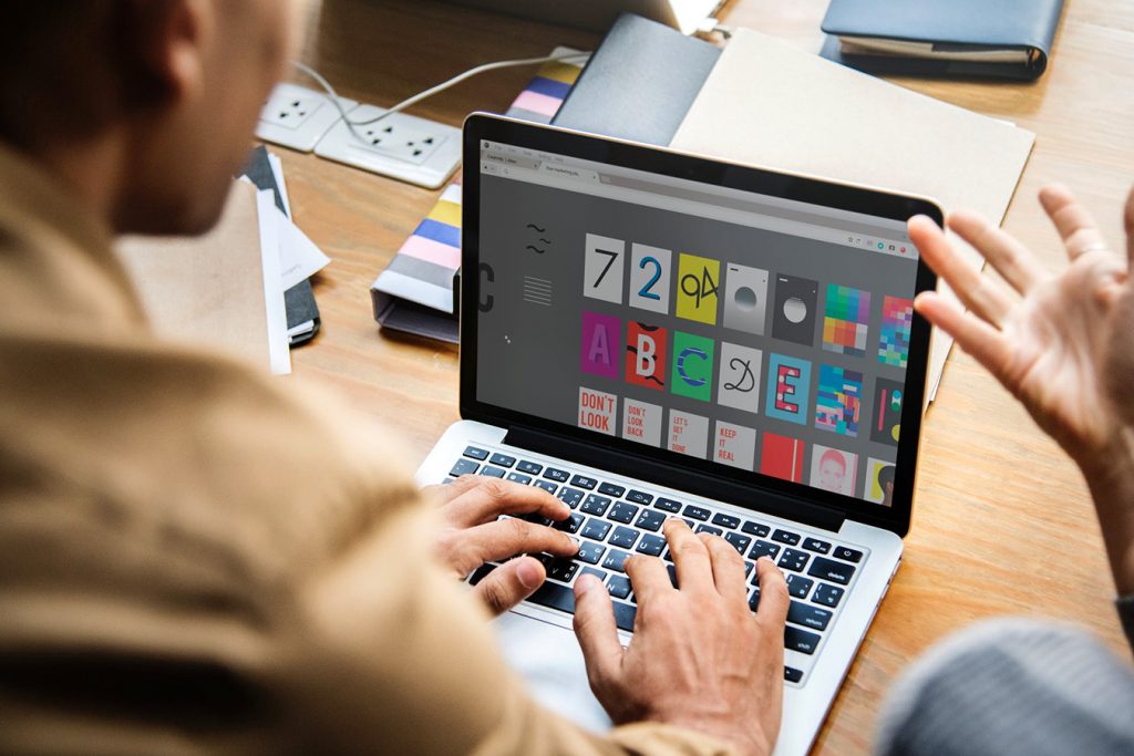
5. Send Them a Text
When it comes to adding text to your logo, well…. Maybe you don’t need to add text at all. Too much text can make your design overwhelming for customers and potential clients, and can make your logo difficult to read at a moment’s notice. Logos work better as abstractions, according to Inside Design, “because some kind of disconnect [between the logo and the service provided] is often helpful and stimulating.” The more text you add, the more obvious your message becomes, and that can make the logo less interesting.
If you do add text, then note that fonts also have their specific connotations. Comic Sans might be useful if you’re a circus ringmaster or rodeo clown, but most marketing campaigns will require a more sophisticated typeface. To learn more about traditional serifs and contemporary sans serifs, read our “How to Create Different Font Pairings” article on Zazzle Ideas!
6. Test It, 1, 2, 3
Before you send your logo to the printers (or add business cards to your cart on Zazzle), it’s worth checking that your design is versatile and scalable. While your artwork might look good on paper or in the design tool, this isn’t representative of how the logo will be experienced on an everyday basis; “[y]ou want a logo that can be blown up super large for a billboard but also scaled down for screening onto the side of a pen,” according to Hubspot.
Helpfully, Zazzle has an easy way to experiment with your logo. On any Zazzle page, navigate to the top three horizontal lines in the top-left corner. From there, click the ‘Create’ button, and on ‘View All.’ These blank templates allow you to upload artwork to a range of items, and you can see your work in real time; this will act as a test of the logo, and you’ll be able to see if it works as well on other products. The ‘Transfer design to another product’ function, located under the product image, also allows you to switch between templates.
7. Review and Repeat
Finally, no logo should be approved without getting the text proofread and without getting a second opinion (or perhaps a third and fourth). Indeed, if you’re unsure at any stage of the process, then why not take some sketches or concept art to someone that matches your “buyer persona” – your ideal customer profile? This will give you an objective indication of whether it’s worth proceeding to the next stage with your design, or whether it’s unappealing for some reason.
According to Creative Bloq, a logo is usually the first piece of branding that a customer sees, and it’s also the piece that makes the biggest impression. With that in mind, and considering the difficulty of creating a logo that will – hopefully – last decades, then it’s important to realize that creating a great logo can’t be done overnight. The more time you spend in the R&D phase, the better, as you don’t want to introduce your customers to a logo that you’re unhappy with, or that you want to redo in a year or two. Be prepared to start all over again (and again and again) until you’ve developed something truly special.
We hope that the above instructions will help your logo design get off the ground! What are some of your favorite logos, or what do you think are the components of a great logo? Let us know in the comments below, and check out our business articles on Zazzle Ideas for more entrepreneurial advice!
Editor’s Note: This post was originally published in May 2019 and has been updated for accuracy and comprehensiveness.

Eoin is a Content Specialist at Zazzle in Cork. He’s recently bought a house with his fiancée, and thus most of his time these days is spent trying to keep the walls from caving in and the wolves from the door. Still, he’s always open to book, game, and movie recommendations, so if you have some, let him know: he’ll add them to a very, very long list.
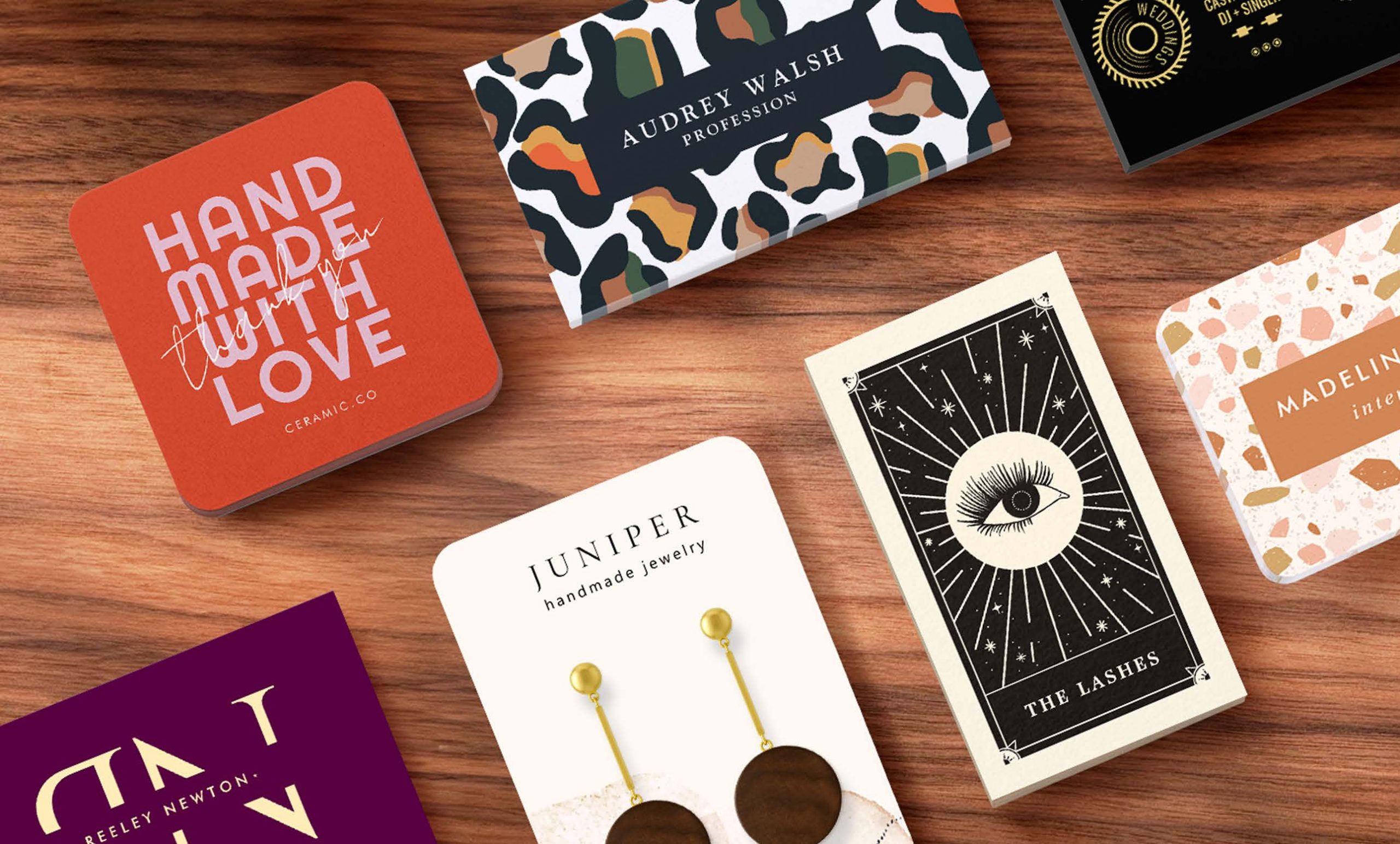
There are three primary elements to consider as logo design building blocks. Though it’s rare to include them all in a single logo. Consider your mission statement as a guideline for what you want people to think.
Good tips, Michael!
Wow! This is an amazing and helpful article. Appreciate the specific details and explaining each element of a logo.
Wow! This is an amazing and helpful article. Appreciate the specific details and explaining each element of a logo.