
There’s a lot more to color than meets the eye. We’re often taken by the vision of something bright and lively — it captures our attention in a flash. At the same time, dark, dramatic hues are also capable of stealing the spotlight when they’re used appropriately. Just what is it that makes good color combinations so appealing? It helps to understand the psychology behind color pairs.
Why Good Color Combinations Matter
It’s often the best color combinations that draw attention and interest to prospective consumers. From a marketing standpoint, there are few tactics as effective as this — yet the beauty of this particular tactic is that it’s not obvious like a slogan or an advertisement. Different shades simply appeal to different people for a number of reasons. Consider just how influential colors are in general.
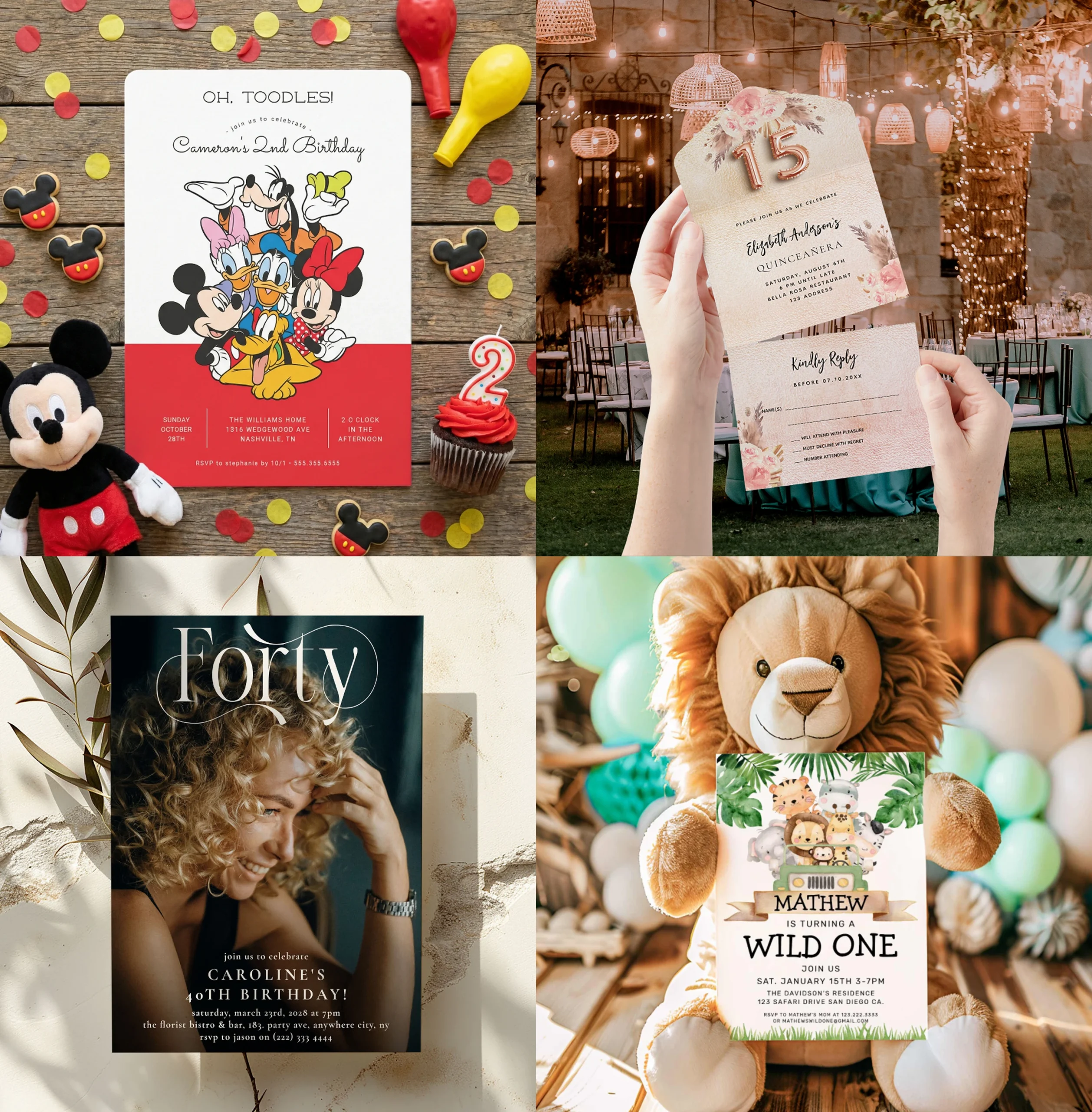
Red, for example, is a dramatic, fiery, and sexy shade that connotes a sense of urgency. Marketers might use it to advertise their sales or special, limited-time-only events to capture attention and ensure that no one misses out on the bargain or deal of a century.
Green, meanwhile, is a tranquil, relaxed, and natural hue that is designed to inspire a sense of calmness and serenity. Companies may elect to use this shade when they want to promote a product that is balancing, harmonizing, and soothing.
Blue is a stable, grounding, and tranquil shade that is often associated with masculinity and dependency. It’s a secure hue that promotes trust, which is why you’re likely to see it in many of the best color combinations — those that stimulate consumers to take action of some sort. In a similar way, purple has a positive association with traits such as regality and respect. It’s an old-world sort of shade that channels creativity and sparks curiosity. Other optimistic shades include yellow and orange.
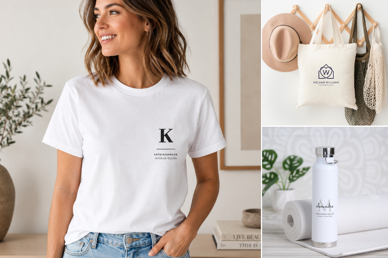
Alone, these colors do quite a job at conveying a certain mood. When used as part of a color pair, however, they’re considerably more impactful at sending a strong message or helping people associate those shades with a particular company. A great example is McDonald’s, whose traditional red and yellow logo is one that has been branded in our collective minds since childhood. It’s a good color combination for a number of reasons, but it’s largely because we immediately associate it with the brand.
Now consider what might happen if the company changed those hues to green and white. It would be jarring, off-putting, and, because consumers are so devoted to what they know and love best, it might even create a global controversy. That’s simply how effective and meaningful color combinations are — both to brands and to clients.

Choosing Color Combinations That Resonate
There are other factors that play into color configurations too. What kind of spirit and vibe does the brand convey? That can affect your choice of warm or cool color schemes. For example, a beauty company specializing in all-natural products can’t effectively share that message if all of its marketing and advertising collateral is created in pink and red. It doesn’t resonate with the brand, and it’s something that consumers are likely to notice — if they notice the brand at all, that is.
But a cool color scheme incorporating shades of green and ivory or blue and white can be transformative. Using shades that are “on brand” is important, because it affects perception — and it’s perception that goes a very long way in driving sales, improving business, and helping companies meet their bottom lines.
This is also why so many businesses engage in testing phases before their major launches. Effective marketing strategies are the lifeblood of businesses large and small, and using the best color combinations can make an impact not just locally, but even globally. The key is to find color pairs that truly engage, inspire, and motivate. Without making a significant impact on consumers, you can’t expect your efforts to go very far. By taking the time to analyze your unique goals, determining who you want to reach, and establishing a game plan to connect with those people, you can be confident that your color scheme will play a vital role in helping you reach the finish line.

From Weddings to Tech, our Zazzle Contributors are experts on a wide variety of topics and information. We hope their advice and ideas will help you be inspired!